1 – Loading Financial Data
Import the following modules
from pandas_datareader import data as web
import datetime as dt
import matplotlib.pyplot as plt
from matplotlib import style
import mplfinance as mpf
import bs4 as bs
import requests
import pickle
import numpy as np
Set a datetime function
start = dt.datetime(2017,1,1)
end = dt.datetime(2019,1,1)
Define a data frame and load financial data into it from Yahoo Finance
df = web.get_data_yahoo('AAPL',start,end, interval='d')
Print the dataframe to show the data
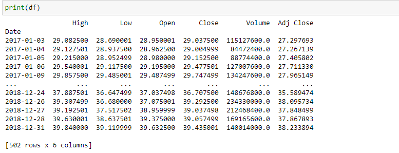
Show just the close column

Show just the close column for a specific date

You can save the data to a csv or xlsx file with the following inputs.
2 – Graphical Visualization
Plot the Adjusted Close price with matplotlib
df['Adj Close'].plot()
plt.show()

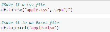
Plotting the graph with labels and styles
style.use('ggplot')
plt.ylabel('Adjusted Close')
plt.title('AAPL Share Price')
df['Adj Close'].plot()
plt.show()
Comparing stocks
visa = web.get_data_yahoo('V',start,end, interval='d')
mastercard = web.get_data_yahoo('MA',start,end, interval='d')
visa['Adj Close'].plot(label="V")
mastercard['Adj Close'].plot(label="MA")
plt.ylabel('Adjusted Close')
plt.title('Share Price')
plt.legend(loc='upper left')
plt.show()

apple = web.get_data_yahoo('AAPL',start,end, interval='d')
facebook = web.get_data_yahoo('FB',start,end, interval='d')
apple['Adj Close'].plot(label="AAPL")
facebook['Adj Close'].plot(label="FB")
plt.ylabel('Adjusted Close')
plt.title('Share Price')
plt.legend(loc='upper left')
plt.show()

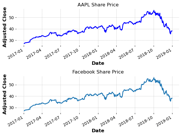
Subplotting
plt.subplot(211)
apple['Adj Close'].plot(color='blue')
plt.ylabel('Adjusted Close')
plt.title('AAPL Share Price')

plt.subplot(212)
apple['Adj Close'].plot()
plt.ylabel('Adjusted Close')
plt.title('Facebook Share Price')

plt.tight_layout()
plt.show()
3 – Candlestick Charts
Let’s set up a candlestick chart to further examine the graph.
mpf.plot(apple, type='candle', style='charles',
            title='Apple, 2017- 2019',
            ylabel='Price ($)',
            ylabel_lower='Shares \nTraded')

4 – Analysis and Statistics
100 Day moving average
#100 Day Moving Average
apple['100d_ma'] = apple['Adj Close'].rolling(window = 100, min_periods = 0).mean()
#Remove NaN-Values
apple.dropna(inplace=True)
print(apple.head())

Visualization
ax1 = plt.subplot2grid((6,1),(0,0), rowspan = 4, colspan = 1)
ax2 = plt.subplot2grid((6,1),(4,0), rowspan = 2, colspan = 1, sharex = ax1)

ax1.plot(apple.index, apple['Adj Close'])
ax1.plot(apple.index, apple['100d_ma'])
ax2.fill_between(apple.index, apple['Volume'])

plt.tight_layout()
plt.show()

Additional Key Statistics
#Percentage Change
apple['PCT_Change'] = (apple['Close'] - apple['Open']) / apple['Open']
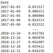
print(apple['PCT_Change'])

#High Low Percentage - How volatile the stock is
apple['HL_PCT'] = (apple['High'] - apple['Low']) / apple['Close']
print(apple['HL_PCT'])
5 – Regression Lines
The Linear Regression Line is mainly used to determine trend direction
Load financial data
start = dt.datetime(2016,1,1)
end = dt.datetime(2019,1,1)

apple = web.get_data_yahoo('AAPL',start,end, interval='d')
data = apple['Adj Close']

#Quantify our dates in order to be able to use them as X-values
x = data.index.map(mdates.date2num)

#Use Numpy to create a linear regression line
fit = np.polyfit(x, data.values, 1)
fit1d = np.poly1d(fit)
Plot the graph
plt.grid()
plt.plot(data.index, data.values, 'b')
plt.plot(data.index, fit1d(x),'r')
plt.show()

Setting the time frame
rstart = dt.datetime(2018,7,1)
rend = dt.datetime(2019,1,1)

#Create a new data frame and cut off all other data entries
fit_data = data.reset_index()
pos1 = fit_data[fit_data.Date >= rstart].index[0]
pos2 = fit_data[fit_data.Date <= rend].index[-1]

fit_data = fit_data.iloc[pos1:pos2]
Rewrite the function
dates = fit_data.Date.map(mdates.date2num)

fit = np.polyfit(dates, fit_data['Adj Close'], 1)
fit1d = np.poly1d(fit)

plt.grid()
plt.plot(data.index, data.values, 'b')
plt.plot(fit_data.Date, fit1d(dates), 'r')
plt.show()

The slope is negative, since the prices go down in that time frame.
